


Unleashing the Power of Data Insights & Analytics for Business Success
In today’s data-driven world, the power of big data to transform businesses and drive success is nothing short of remarkable. Hence the ability to transform raw data into actionable insights is essential. Whether you’re a digital marketing professional aiming to boost campaign performance, a small-scale e-commerce business owner seeking growth opportunities, or a project manager tasked with data-driven decision-making, mastering analytics is crucial.

In today’s data-driven world, the ability to transform raw data insights into actionable insights is essential. Whether you’re a digital marketing professional aiming to boost campaign performance, a small-scale e-commerce business owner seeking growth opportunities, or a project manager tasked with data-driven decision-making, mastering analytics is crucial. As per an article published by financesonline.com, The estimated total value of the business analytics software market in 2023 is $57 million, a survey by Allied Market Research revealed.
This comprehensive guide will equip you with the knowledge and tools to become a proficient analytics practitioner. From improving efficiency to selecting the right KPIs and mastering dashboard management, this blog covers it all.
Improving Efficiency in Managing Analytics
Automating Analytics Tasks
Let’s start with automation: It’s not just about saving time; it’s about making your insights more accurate and accessible. By automating routine tasks, the following can be achieved.
– Reduce human errors in data handling.
– Focus on strategic data interpretation.
– Respond to real-time data changes promptly.
Tools and Techniques for Automation
To embark on your automation journey, explore tools like Python, and R, and platforms like Zapier. APIs play a crucial role in connecting different tools and data sources, enabling seamless integration of data insights and processes. Many analytics platforms offer built-in automation features.
Implementing Data Automation Workflows
Creating data automation workflows is key to streamlining analytics processes. Learn how to:
– Design workflows for data collection, cleansing, and reporting.
– Ensure data consistency and reliability.
– Eliminate the risk of manual errors through automation.
Don’t be afraid to experiment!
Data Insights can help you make better decisions, but it can’t tell you everything. Sometimes, the best way to learn is by experimenting. Try different things and see what works best for your business. Then, use data insights to track your results and make adjustments as needed.
Make Data Accessible to Everyone
Data is only valuable if it’s used. Make sure that everyone in your organization has access to the data insights they need to do their jobs effectively. This includes both decision-makers and front-line employees.
Use Data to Create a Data-Driven Culture
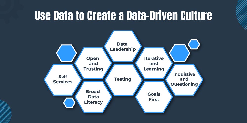
A data-driven culture is one where everyone in the organization is comfortable using data to make decisions. This requires creating a culture of trust and transparency, and it also requires providing employees with the training and resources they need to use data effectively.
Here are some additional tips for beginners in analytics:
Start with the basics. Before you can start using data insights to grow your business, you need to learn the basics of analytics. This includes understanding how to collect, clean, and analyze data. There are many resources available online and in libraries to help you learn about analytics.
Data Visualization Tools for Efficiency
Data visualization isn’t just about making data pretty, it’s about enhancing understanding.
Discover how:
– Visualizations simplify complex data.
– Choosing the right visualization type enhances data storytelling.
– Well-designed visualizations improve data-driven communication.
Tools and Platforms
Navigate the world of data visualization tools with ease:
– Popular choices like Tableau, Power BI, and Google Data Studio.
– Cloud-based platforms that enable real-time collaboration.
– Criteria for selecting the right tool based on your data needs.
Best Practices in Data Visualization
Going beyond charts and graphs, learn the art of effective visualization:
– Keep it simple with clear labels and legends.
– Understand the psychology of color choices.
– Embrace storytelling through data visualization.
Here are some genuine insights about data visualization tools for efficiency:
Choose the right tool for your needs. There are many different data visualization tools available, each with its own strengths and weaknesses. Consider your data insights needs, budget, and team’s skills when choosing a tool.
Use data visualization to tell a story. The best data visualizations are not just pretty; they tell a story. Think about what you want your audience to learn from your visualization and choose a chart type that will help you communicate your message effectively.
Keep it simple. It’s tempting to cram as much data as possible into one visualization, but this can often make your visualization difficult to read and understand. Focus on one or two key takeaways and choose a chart type that will help you highlight those takeaways.
Use color and labels wisely. Color can be a powerful tool for data visualization, but it’s important to use it carefully. Avoid using too many colors, as this can make your visualization cluttered and difficult to read. Labels are also important for helping your audience understand your visualization. Make sure your labels are clear and concise.
Share your visualizations. Once you’ve created a data visualization, be sure to share it with your audience. You can share your visualizations online, in presentations, or in reports. When sharing your visualizations, be sure to provide context and explanation so that your audience understands what they’re looking at.
Here are some specific ways that data visualization tools can improve efficiency:
Speed up data analysis. Data visualization tools can help you quickly and easily identify patterns and trends in your data. This can save you a significant amount of time when analyzing large datasets.
Improve communication and collaboration. Data visualization tools can help you to communicate your findings to others in a clear and concise way. This can be helpful for collaborating with colleagues, presenting your findings to management, or sharing your findings with the public.
Make better decisions. Data visualization tools can help you to make better decisions by providing you with insights into your data that would be difficult to see otherwise. For example, you can use data visualization tools to identify the most popular products, the most effective marketing campaigns, or the most efficient business processes.
Importance of Dashboards in Analytics
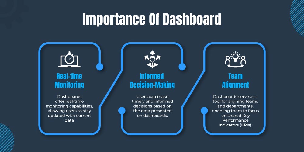
Dashboards are essential tools for data visualization and analysis. They provide a centralized view of key metrics and trends, enabling users to quickly and easily identify patterns and insights. Dashboards can also be used for real-time monitoring, enabling users to make timely and informed decisions. Additionally, dashboards can be used to align teams and departments around shared KPIs.
Design Principles for Effective Dashboards
When designing dashboards, it is important to prioritize clarity, consistency, and minimalism. Dashboards should be easy to understand and navigate, with all relevant information clearly labeled and organized. Additionally, dashboards should be visually appealing and engaging, without being cluttered or overwhelming.
Here are some specific tips for designing effective dashboards:
– Use a clear and consistent layout. Dashboards should have a clear and consistent layout that is easy to navigate. Use consistent colors, fonts, and symbols throughout the dashboard to make it visually appealing and easy to read.
– Prioritize the most important information. Place the most important information at the top of the dashboard, and use larger fonts and colors to make it stand out.
– Use interactive elements. Interactive elements, such as filters and drill-downs, can make dashboards more engaging and informative. Allow users to explore the data in more depth and gain deeper insights.
– Make it mobile-friendly. More and more people are using their mobile devices to access data and insights. Make sure your dashboards are responsive and mobile-friendly so that users can view them on any device.
Real-world Examples of Dashboard Usage
Dashboards are used by businesses of all sizes in a wide range of industries. Here are a few examples of how dashboards are being used in the real world:
– Airbnb uses dashboards to track key metrics such as occupancy rates, booking revenue, and guest satisfaction. This data helps Airbnb to make informed decisions about pricing, marketing, and product development.
– Netflix uses dashboards to track key metrics such as viewership time, content popularity, and customer churn. This data helps Netflix to make informed decisions about content production, acquisition, and distribution.
– Salesforce uses dashboards to track key metrics such as leads generated, opportunities created, and closed deals. This data helps Salesforce to track the performance of its sales teams and identify areas for improvement.
Choosing the Right KPIs for Analytics & Data Insights
When choosing KPIs for your analytics dashboards, it is important to consider your overall business goals and objectives. KPIs should be specific, measurable, achievable, relevant, and time-bound. Additionally, KPIs should be aligned with your business strategy and priorities.
Here are some tips for choosing the right KPIs for your analytics dashboards:
– Start with your business goals. What do you want to achieve with your business? Once you know your goals, you can identify the KPIs that will help you measure your progress.
– Consider your target audience. Who is going to be using your dashboards? Choose KPIs that are relevant to their needs and interests.
– Use a mix of leading and lagging indicators. Leading indicators predict future performance while lagging indicators measure past performance. Both types of indicators are important for making informed decisions.
– Be flexible and adaptable. Your business goals and priorities may change over time. Be prepared to update your KPIs and dashboards as needed.
Setting SMART Goals for Analytics
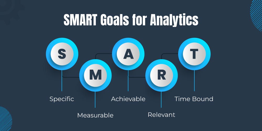
SMART goals are specific, measurable, achievable, relevant, and time-bound. When setting SMART goals for your analytics initiatives, consider the following:
– Specific: Clearly define what you want to achieve. For example, rather than setting a vague goal like “increase sales,” specify ” increase online sales by 10% in the next quarter.”
– Measurable: Determine how you will measure your progress and success. In the example above, the measurement is a 10% increase in online sales.
– Achievable: Ensure that your goal is realistic and attainable. Setting an unattainable goal can lead to frustration and demotivation.
– Relevant: Your goal should align with your broader business objectives and strategies. It should be relevant to the success of your organization.
– Time-bound: Set a timeframe for achieving your goal. This adds a sense of urgency and accountability. In the example, the timeframe is “in the next quarter.”
Identifying Key Metrics
Identifying key metrics involves selecting the specific data points that will help you track your progress toward your goals. When identifying key metrics:
– Consider what data is most relevant to your goals and objectives.
– Look for leading indicators that can help you predict future performance.
– Use historical data and industry benchmarks to inform your choices.
For example, if your goal is to increase website traffic, key metrics might include:
– Monthly website visitors
– Bounce rate
– Conversion rate
– Traffic sources (organic, paid, social)
These metrics provide insights into the effectiveness of your website and marketing efforts.
KPIs Aligned with Business Strategy
KPIs should be directly linked to your business strategy and priorities. They should reflect the specific goals and objectives that are most important to your organization.
For example, if your business strategy is to expand into new markets, your KPIs might include metrics related to market penetration, customer acquisition, and revenue growth in those markets. If your strategy is to improve customer retention, your KPIs might focus on customer satisfaction, churn rate, and customer lifetime value.
Tracking and Measuring KPIs
Once you’ve identified your KPIs, it’s essential to establish a system for tracking and measuring them. This may involve:
– Setting up data collection processes to gather relevant data.
– Implementing analytics tools and software to monitor KPIs in real time.
– Creating reports and dashboards that provide a visual representation of KPI performance.
– Regularly reviewing and analyzing KPI data to identify trends and insights.
Using KPIs for Informed Decisions
The ultimate purpose of tracking and measuring KPIs is to use the insights gained to inform decision-making. This might include:
– Identifying areas where performance is falling short of targets and taking corrective action.
– Recognizing areas of success and scaling strategies that are working well.
– Making data-driven decisions to allocate resources, adjust marketing campaigns, or pivot business strategies.
By leveraging KPI insights, organizations can make informed and strategic decisions that drive growth and success.
Managing the Analytics Dashboard
Effective dashboard management involves designing, maintaining, and optimizing your analytics dashboards for maximum impact.
This includes:
– Ensuring that dashboards are user-friendly and easy to navigate.
– Keeping dashboards up-to-date with real-time or near-real-time data.
– Regularly reviewing and refining dashboard design and content based on user feedback and changing business needs.
By following these principles and best practices, you can create and manage analytics dashboards that empower your organization to make data-driven decisions, achieve its goals, and thrive in today’s data-driven business landscape.